

Challenge
The merger of equals PotlatchDeltic and Rayonier created a leading land-resources REIT with a combined portfolio of about 4.2 million acres. The importance of signalling both continuity and modernization meant that the decision was made to keep one legacy name and refresh the logo and visual identity.
Opportunity
The new brand needed to look to the future while respecting the rich heritage and shared land stewardship culture of both companies. It needed to function like a bridge, balancing transformation and modernization narrative with the needs of multiple stakeholders, from investors to regulators to rural communities.
Solution
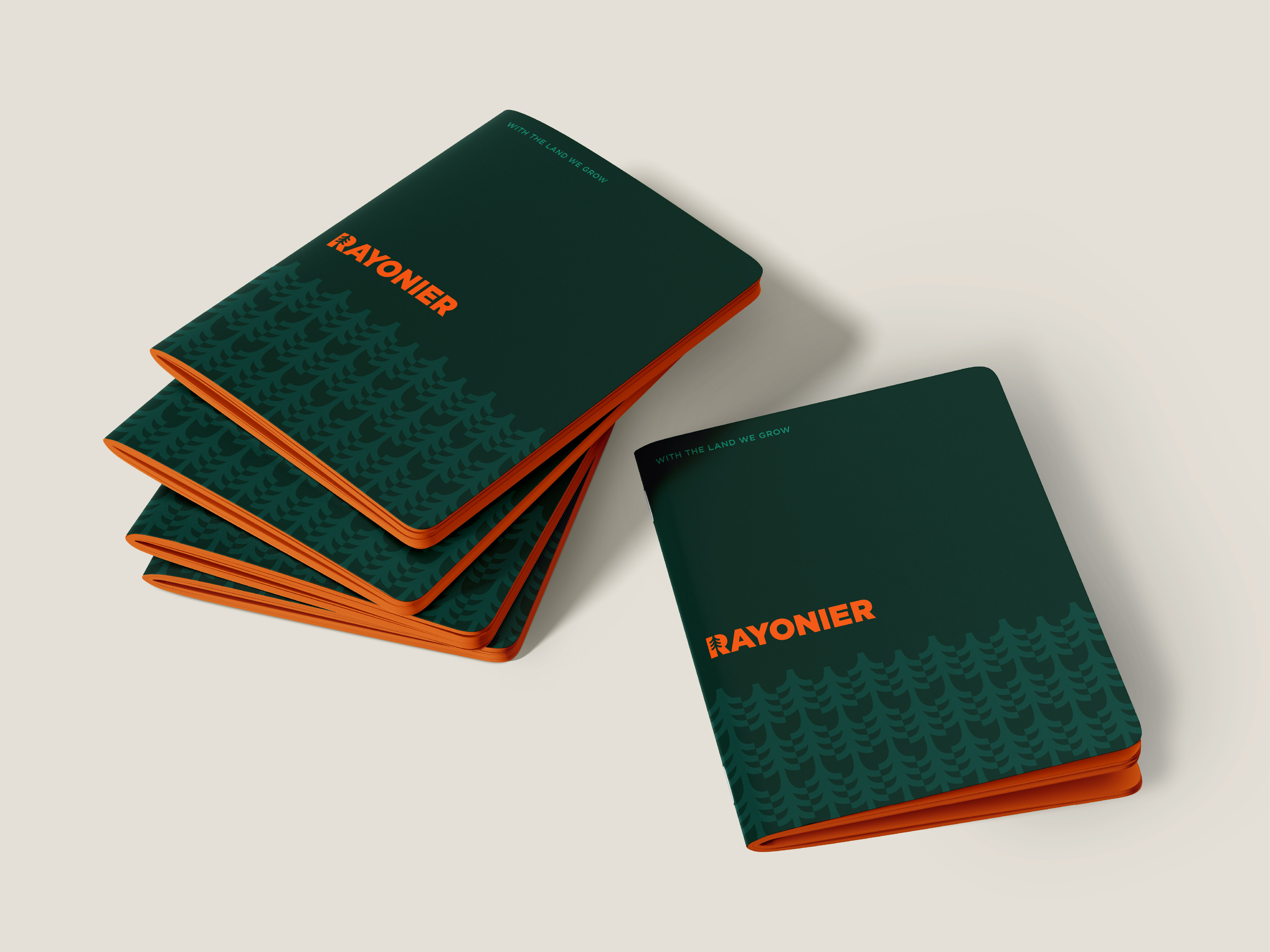
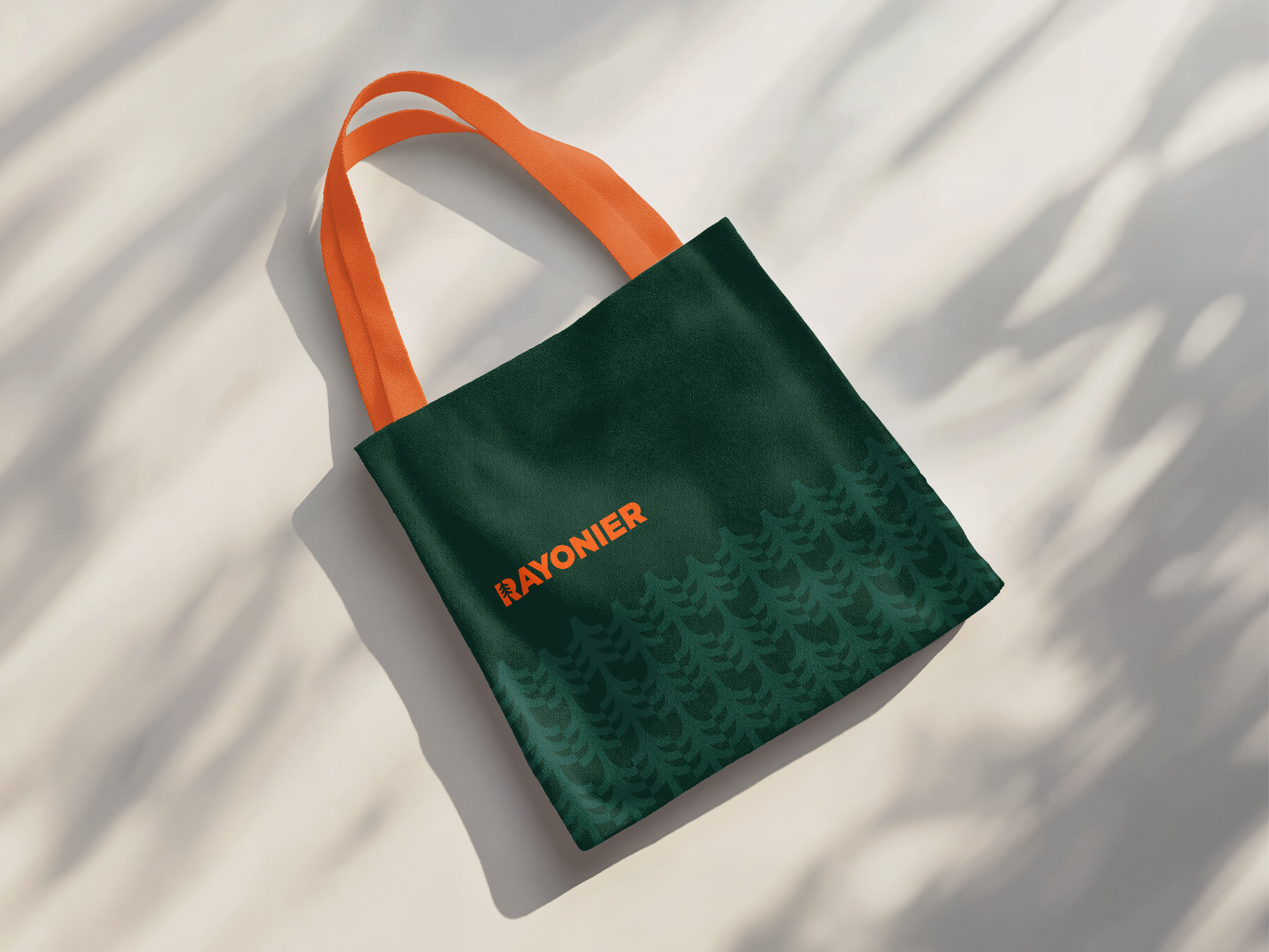
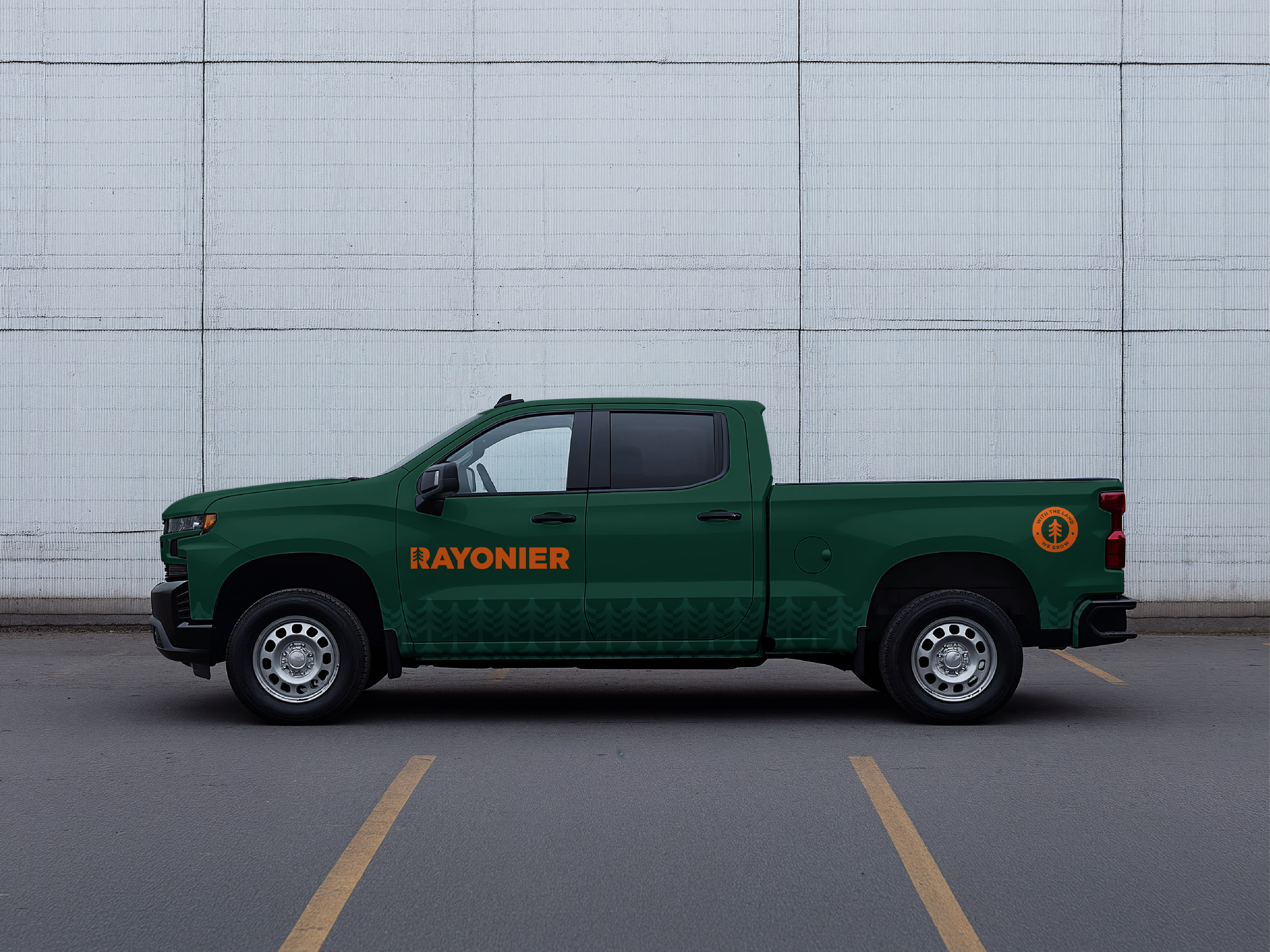
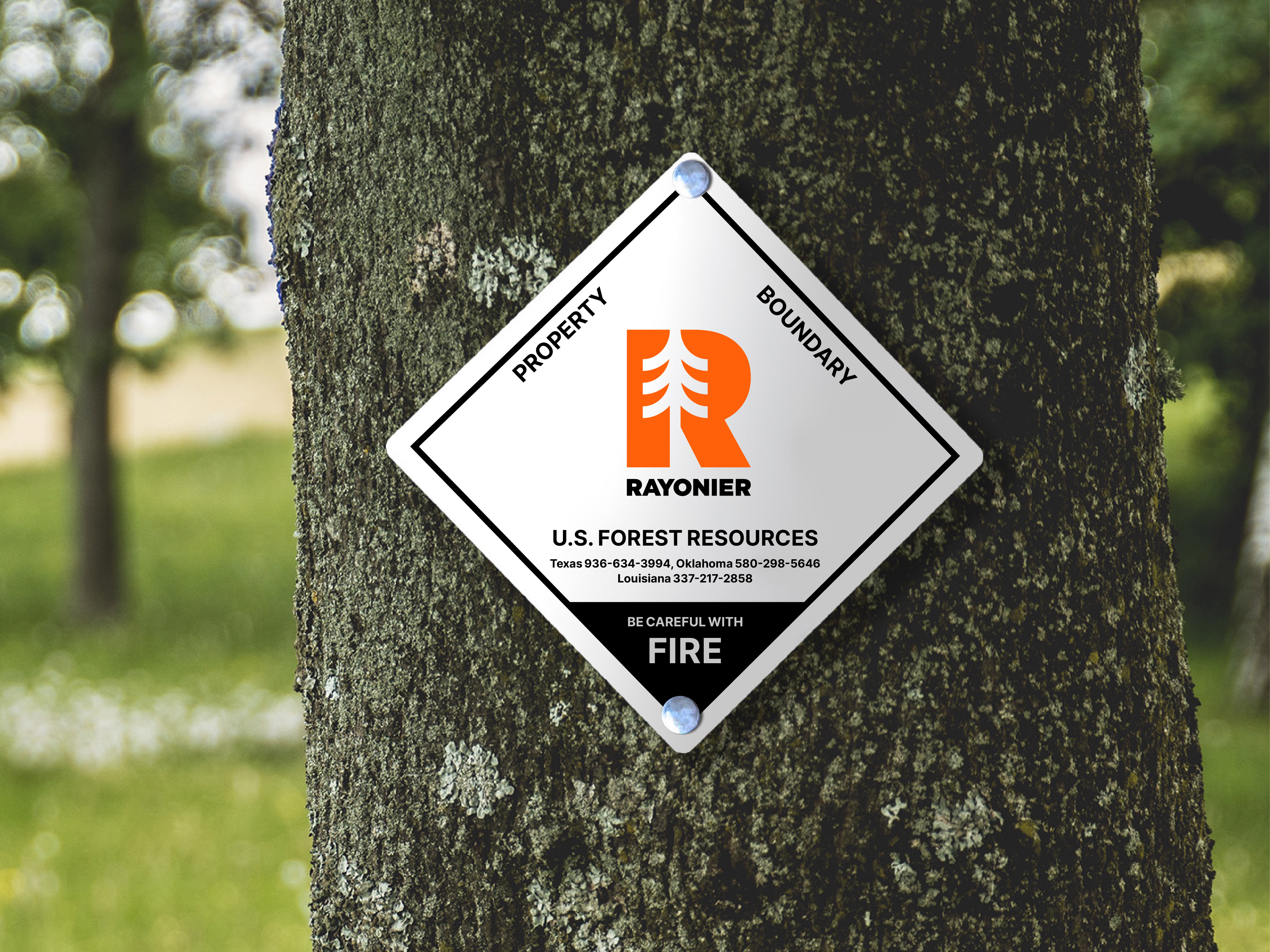
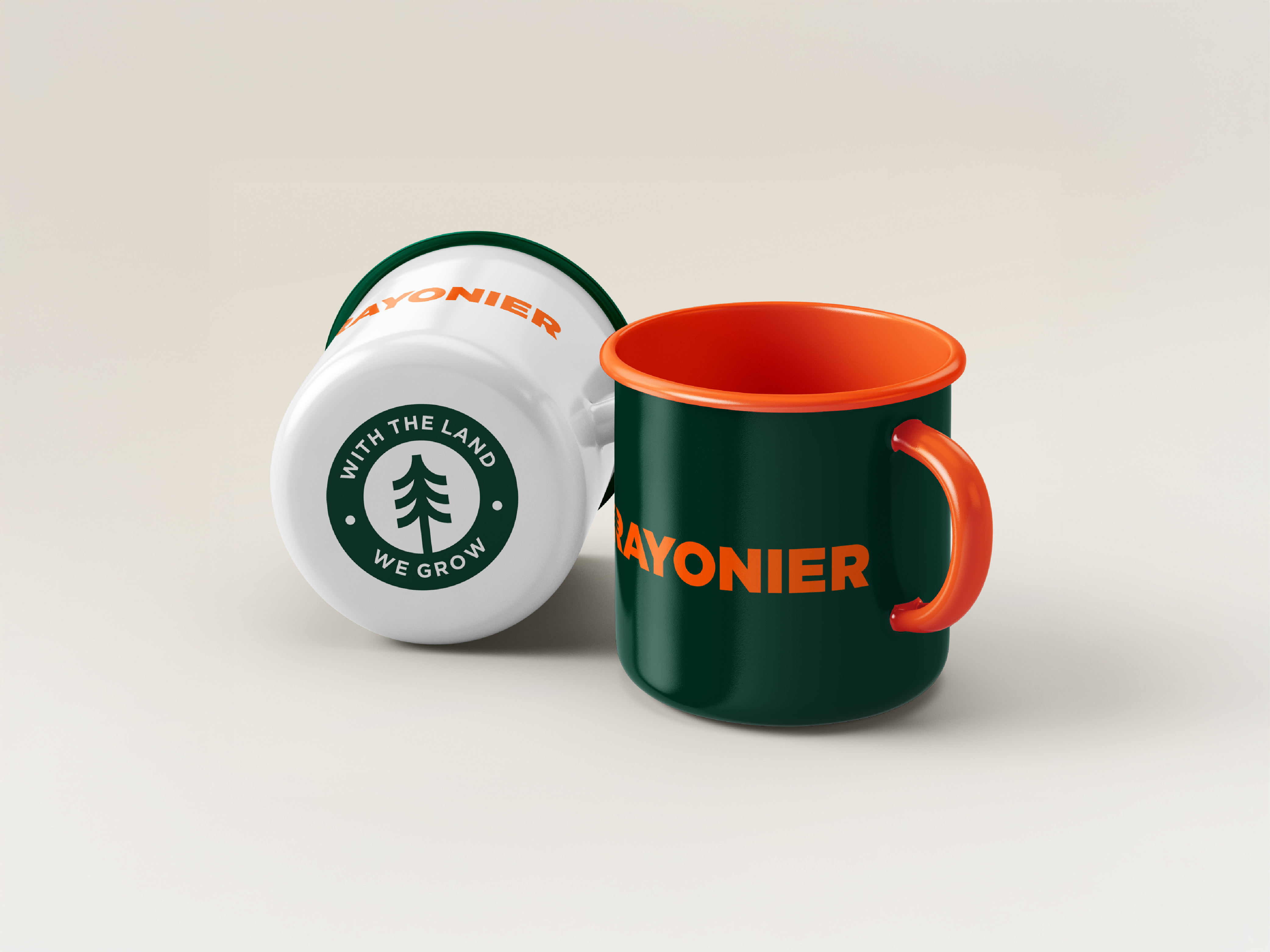
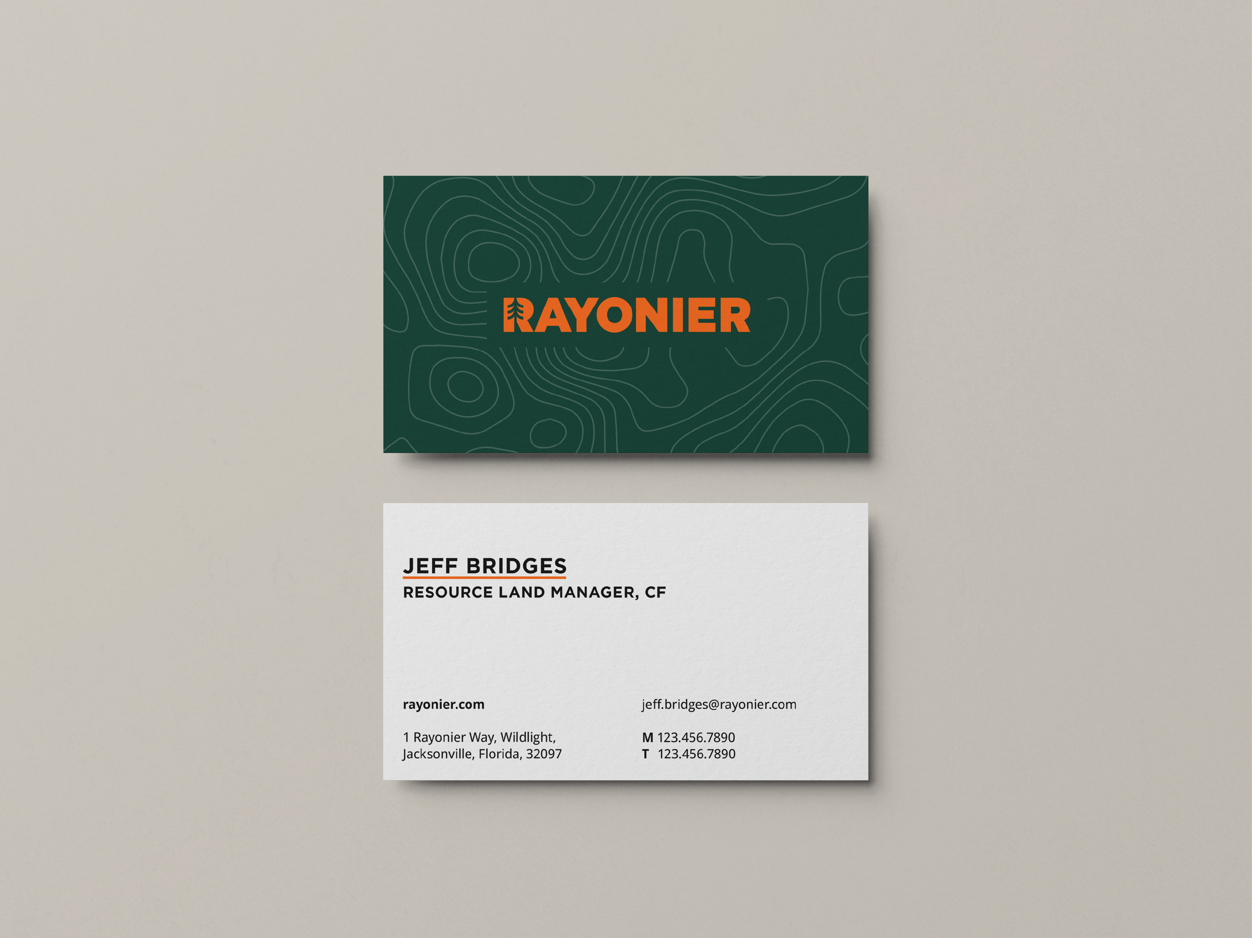
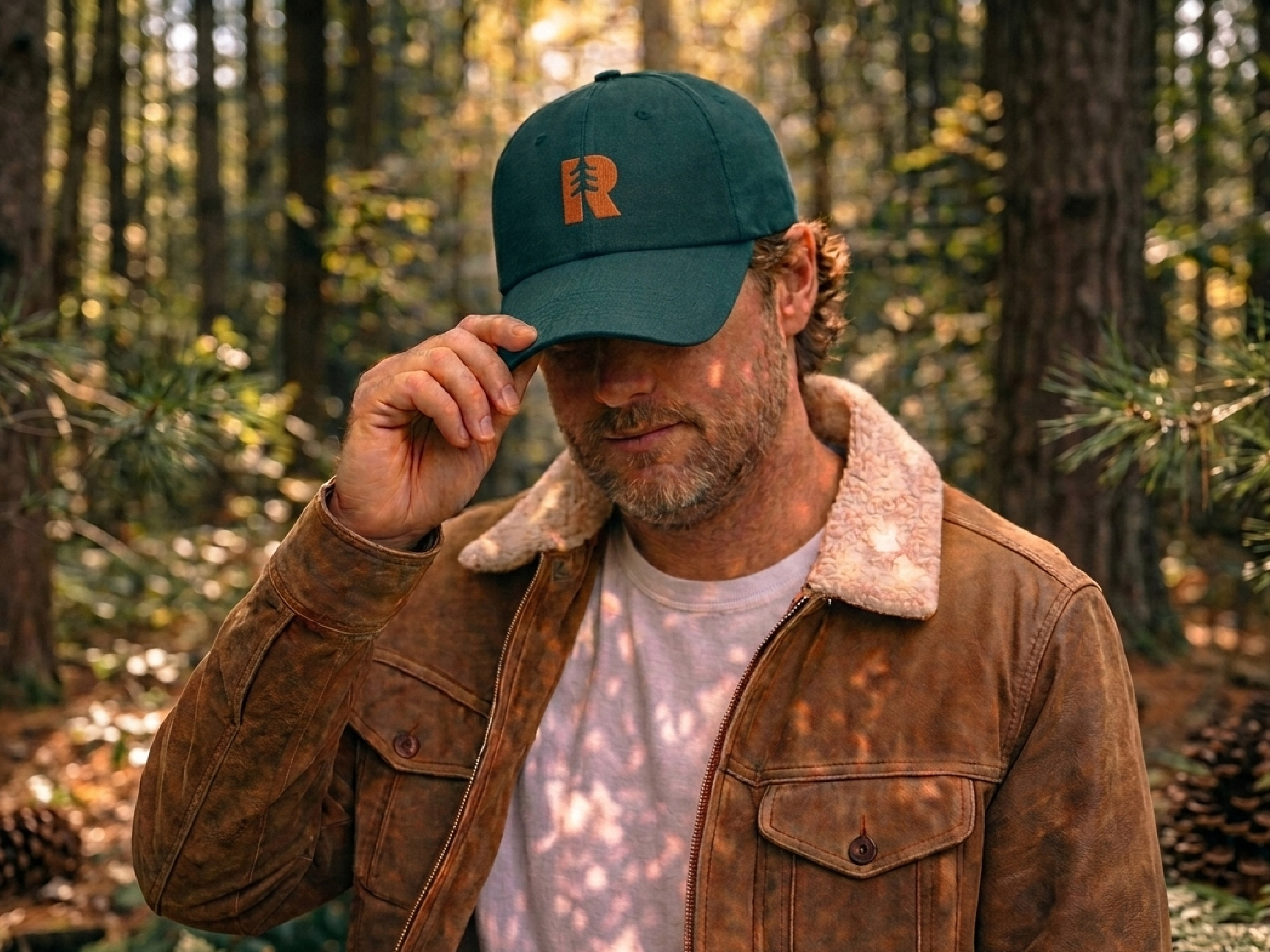
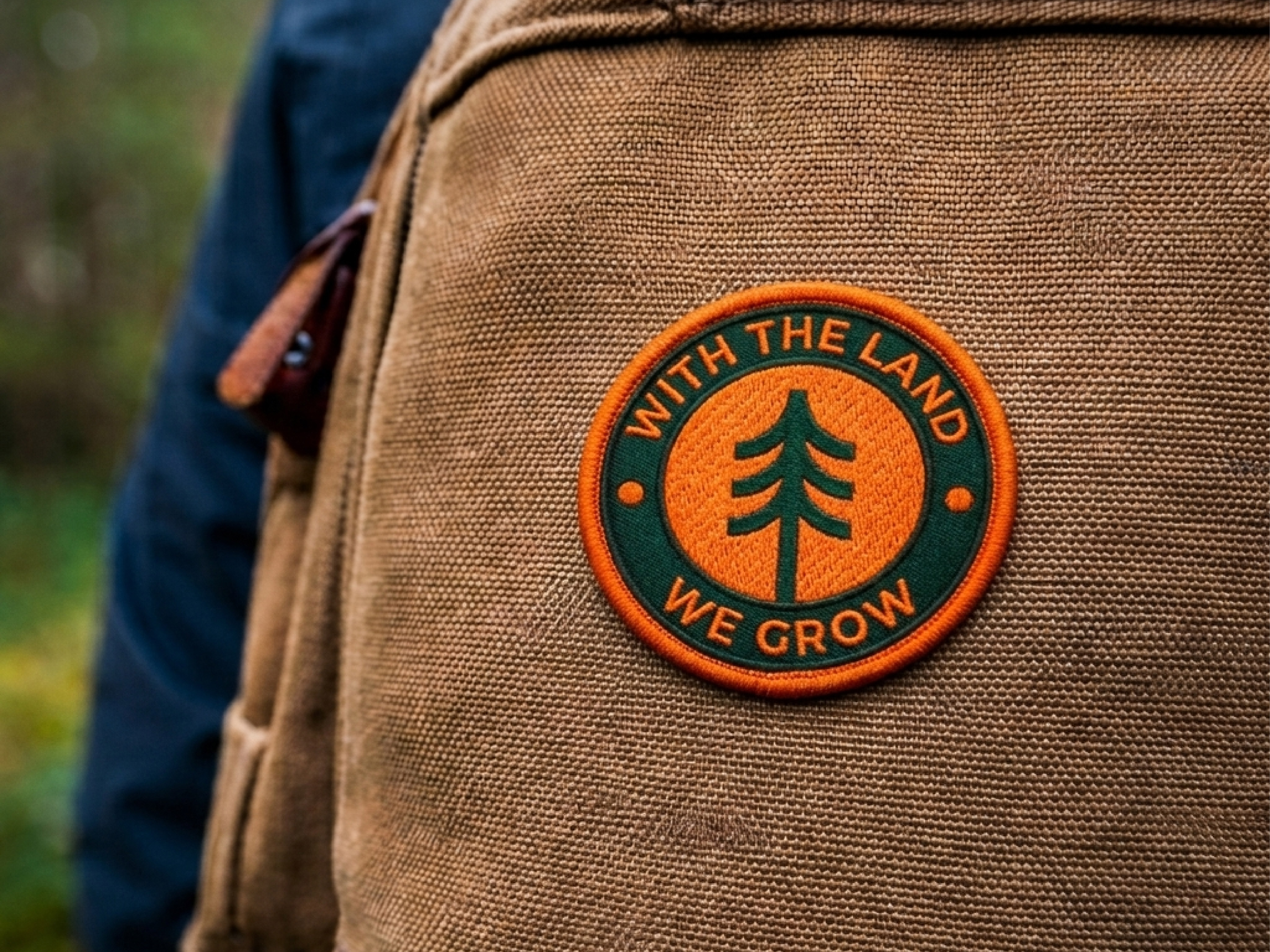
The rich timberland heritage of the company is embedded in a bold, solid logotype in a vibrant orange that suggests a new era for the company. The new identity speaks to the future as well as the natural assets at the core of the Rayonier business.