repositioning a global macro investment fund around its distinctive, on-the-ground approach to investing
/growth
/growth
Situation
Autonomy’s unique ‘immersive’ approach to investing – which blends themes, local markets and the long-term into a philosophy as much as a process – sets it apart from more conventional firms.
Solution
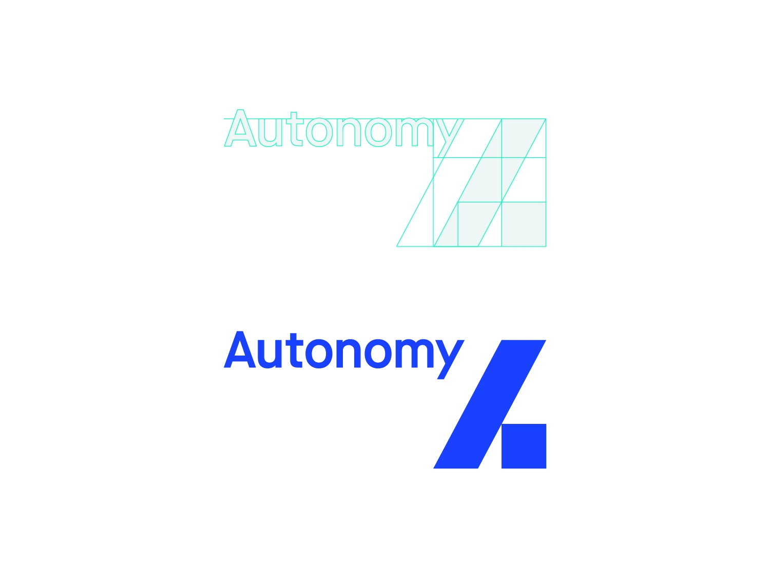
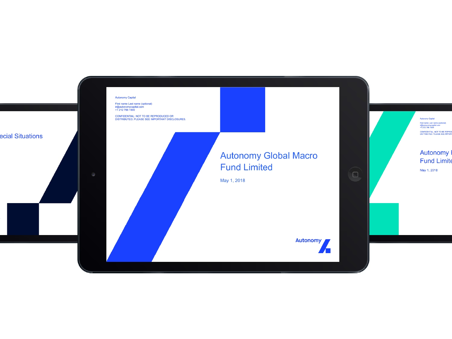
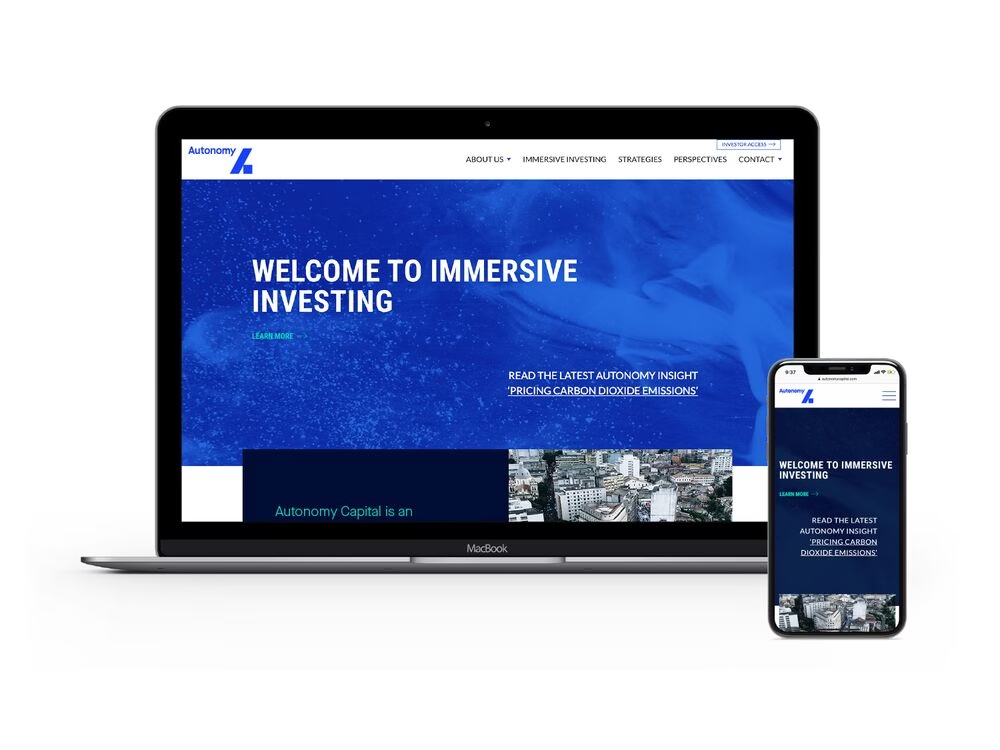
We rebranded the firm, giving it a new logo that communicates strength, independence, precision and harmony, through the angled balance of the logo elements. The supporting graphic identity is supported by a set of guidelines that is can be viewed as a PDF or printed out as a striking poster.
Insight
This is a design solution that reflects the interplay of the macro and micro forces that Autonomy understands so well.